
Firstly I started with a circle which i flattened to create the ground floor plan. I decided to go with the circular shape for movement where their would be no awkward corners that would be hard to manoeuvre out of. I decided then to go for a natural walnut wood for a sustainable design with smooth floors.

To allow people to know when they have entered my office space, I then included two scripts; one that shows a welcome message of 'Welcome to the office', which is activated when an avatar comes within 3 metres. The second announces an avatar's arrival by playing a sound. This would be for the benefit of visually impaired or death people.
Next I created a central column made out of concrete for the base of the office, as well as a base for the office desk. this construction would provide stability and strength. to further enhance this I created evenly spaced columns to surround the outside of the circle for added support, as well as a frame for a handrail and roof. To highlight this detail in the construction, I lit the ground floor from below to highlight this feature.

I then established a roof that would add visual interest to the design, highlighting the framing and construction of the office. It was also made out of the same texture for consistency for those who are visually impaired, also for sustainable purposes.
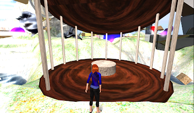

For safety purposes, a handrail was added to surround the circular perimeter, and to also provide a sense of placement. The handrail is intened to visually stand out due to lighting contrast and has been designed at a similar level and same texture as the desk surface. The desk has been placed to surround the inner column for easy accessibility, plus it provides an ample amount of desk space. Originally I thought of making the table top of the desk lay on top of the circular column to provide fruther desk space. However I deemed this unnessacry as people would not be able to reach the centre of the desk anyway, especially people in wheelchairs. For storage I could possibly place something around the outer edges of the office, as I cannot place them under the desk as they would interfere with leg space.

Once I had created an opening in the handrail, so that my office was accessible, I moved on to closing up the exterior face with glass pannels that would allow for light to come into the building as a sustainable approach, as well as create amazing 360degrees views.


At the moment there are gaps between the roofing system and the glass windows for ventalation and to enhance the indoor-outdoor flow, however I may change this for a sealed office but at the moment the open spaces create interesting geometric shapes with the roof.

Inside the office

So there you have it. My first attempt at creating my architectural office space. I intend to develop and change it as new ideas and inspirations come, but this is my first general idea.
