Saturday, August 7, 2010

Photographs of Trash Can design


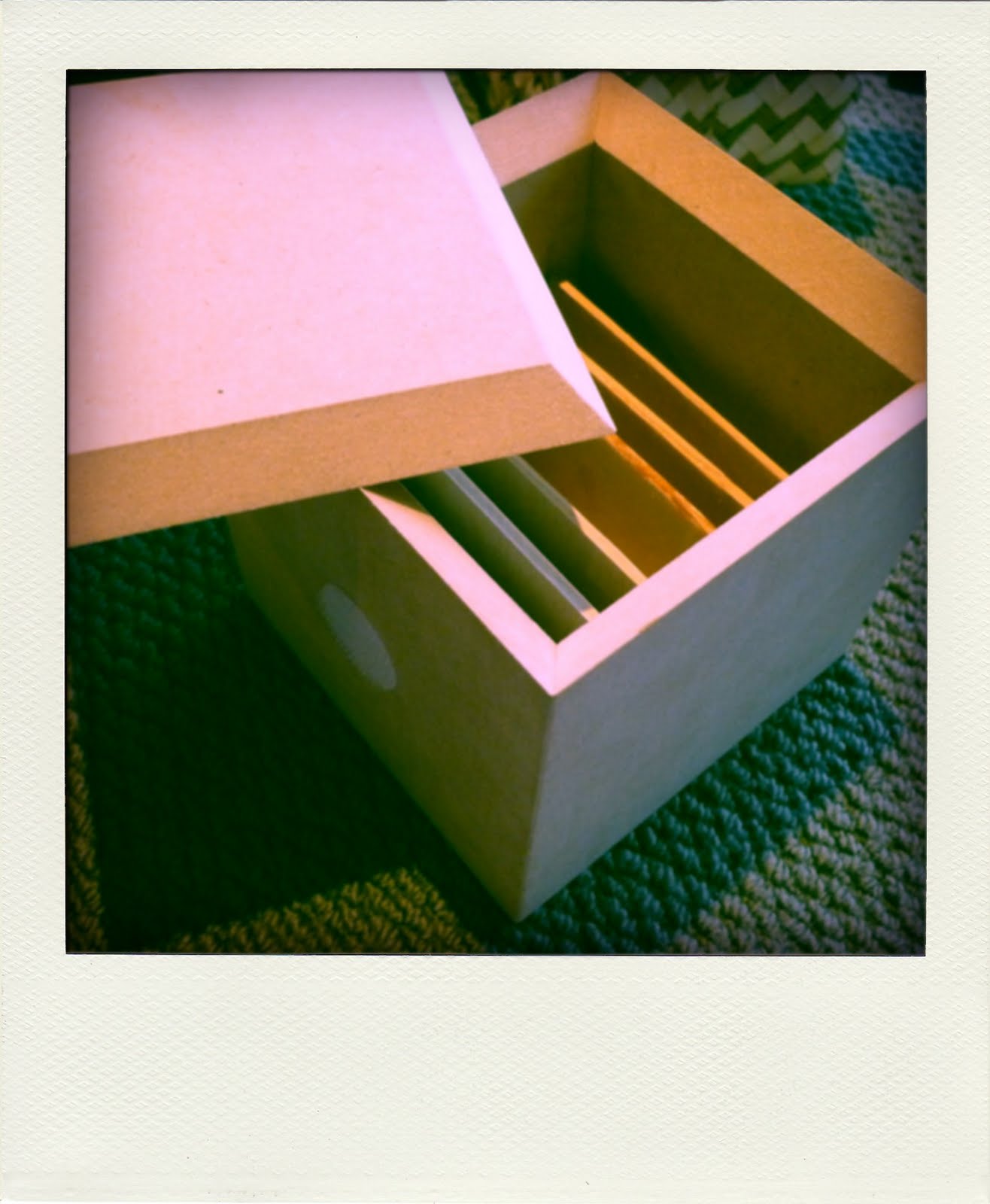
Initial design idea for boxes with slide-out drawer and plastic pockets to hold research. These boxes would spin on a axis, however the spinning element was deemed unnecessary.


The initial stages of designing the different themed boxes out of various materials.


Polaroids being printed out onto photo paper. Images originally from my computer form previous research.

Making plaster box for 'Buildings' Category

Wooden box for 'Detail' category


DETAIL
PLACES
IMAGES
WRITTEN WORD
WRITTEN WORD (looking in)
DRAWINGS
DRAWINGS
PEOPLE
MATERIAL
BUILDINGS

Design 2 - Trash Can


For my trash can I decided that my design junk was the Research I undertake with each
new project. With this I noted the importance of inspiration that comes from research and leads to ideas. To include this instantaneous moment in my trash can, I decided to show my research through the use of polaroids that capture that moment effectively. From there I designed a trash can that reintroduces research through the use of polaroids as that instantaneous moment of inspiration to help with ideas. For them to be a sort of treasure to the holder, the polaroids are categorized into 9 different boxes that relate to that box of treasures you keep underneath your bed. These boxes shall be themed so that their category is obvious just by looking at them, and kept on a sliding wooden system where the boxes can be organized, ranked and looked through at the users leisure.


The polaroids are categorized into eight different categories that all relate to Architectural design:
1. People
2. Places
3. Buildings
4. Detail
5. Material
6. Images
7. Drawings (hand and computer)
8. Written Word.
They can each be sorted into a filing system that allows the user to stick the polaroids on the outside surfaces of the boxes through the use of velcro strips. This allows the user to form ideas from their research in a creative and personal method.

Grotesque Portrait of the Institute


My poster shows the evils of studying Architecture full time. The lack of sleep, the stress and the anxiety through the heart of the studio; our lockers. Its the side of architecture you don't necessarily see, but which you know exists.

Thursday, June 24, 2010

Video showing my avatar's journey through the Office Space.

FINAL ARCHITECTURAL OFFICE DESIGN


So this brings an end to the design of my Architecture Office. Personally I am pleased with the outcome as my main goal was to make sure that it educated my visoters about the three journals and I believe it manages to do this effectively.

The exterior design of the office was simply from my own insipiration, trying to create a natural space that would bring people closer to the outdoors and allow them to feel free, not confined by small spaces and corners, and not held back because of a disiability. This is a space for different people to come and feel at home with their surroundings.


This is my favourite view of my office. At night looking outwards towards the water. The way the roof slopes and the panels of images create an interesting piece of architecture that has amazing movement. It almost looks like a holy place for Architecture, which in some ways this office is as it is celebrating Architecture.

The pannels were lit up at night so that the visuals are clear to see, but also to emphasise the shape of the office which is vital for visually impaired people who rely on lighting and colour contrasts. This means that the handrail, floor and roof line are all highlighted, maping the shape of the room, while the furniture was made a white leather, to create a strong colour contrast with the floor.

At day time, this office is lit up with collages that define Archiecture on the inside, while creating a natural element on the outside of the office with a transparent bush scene. For those whose sight is impaired, I have added sounds that welcome the visoter to the office, allowing the to know that they have entered this space. On the other hand, I have hovering welcome messages for those whose hearing is impaired.
The size of the office had to be expanded from my original to allow adequete room for wheelchairs and accessibility. Therefore I went with a circular single room, as I didnt want seperate cubicles or inhabited corners. I wanted a space that has circulation space throughout with plenty of walking room as wheel as maneuovering room for a person in a wheelchair. Therefore everything was designed with a central axis. The seats however were specifically designed with large spaces between each seat for people with wheelchairs to be able to pass through them.
Timber pillars have been used for the exterior as they are strong, stable and durable when treated. They also harmonize with the surrounding environment, almost creating a haven in this barren land that doesnt have any trees.
The entrance way is located below the small second roof, that also hovers on beams. The whole building seems to be almost lifting off which emphasises the freedom I want my visoters to feel. The slops of the roof was designed to establish this idea, as well as architecturally being parallel with the sloping hill below.

The office is supported by these various columns, along with the central support, all out of timber. Combined with the boardwalk, this creates a typical bushwalk scene in New Zealand.
The sloping roof facing outwards, away from the other offices, but ou towards the quite ocean so my visoters can get a peace of mind and feel relaxed when the come or work in the Architectural Office.
The decking outside, is to allow some maenuvering room on the rough terrain with a slight ramp on the left hand side for access, as well as creating a boardwalk to the next office. This decking creates some much needed flat space where people with disabilities would be able to take a break and simply enjoy the views.


The desk in the centre is circular to harmonize with the rest of the room and also taking into consideration the reaching point of people in wheelchairs or people with disabilities. There wouldnt be much point in having the desk as one flat surface as the middle of the desk would be unaccessible. The chairs also taper inwards for easy navigation around the objects, and the desk edge is rounded for safety purposes.
Favourite view :) - Inspiring.

Alpha Channel Material

So the following images are my Alpha Channel Materials, that I have created from the books I sourced to educate my audience what details and needed in and for architecture, and showing this through visuals that will encapture the attention of visoters. They are a mix of random images that have signigificance to Architecture, however I am not applying that these only define what Architecture is about.
They contain images of well-known architects, buildings and spaces, drawings and plans, and snapshots of the architecture office itself to integrate them all together.

Tuesday, June 22, 2010

The Architecture Office

These are the main points that I will focus on for the design of my Architecture Office. They will all need to be taken into careful consideration while taking note of the 100 prim limit.

  1. Dimensions - Measurements based on the height and reaching points of people.
  2. Accessible Routes - Stairs/ramps/elevator/walkway
  3. Maneuvering areas - circulation space
  4. Hand Rails
  5. Lighting - to highlight hazards, pathways and objects. Note: should not shine into a person's eye
  6. Audio devices
  7. Seating
  8. Colours - colour contrasting and signage.
  9. Details about Architecture
  10. Visuals
  11. Materials

Combining "DETAIL" and "METROPOLIS"


For the images I am planning on using, they have to really portray the essence of Architecture to be educational and in an indepth way that I can effectively communicate visually. For this reaosn I created the above bubble diagram so that I could understand what I personally believe Architecture to be. This has created a series of topics and ideas that I plan on going into through the use of visuals. I will concentrate on the History and development of Architecture, as well as modern architecture and sustainability. I will look for images of the way architects have conveyed these ideas through the use of drawings and visuals. Plus I will focus on the works of world-famous architects, that have contributed much to society and created famous works of art.
For this I went to the Architectural Library and found the following books which I plan as using as references.
1. Architectura: elements of architectural style, by Miles Lewis (call number 72.03 A673ml)
2. New Architecture:an international atlas, by Francisco Asensio (call number 72.036.6 A816n)
3. Twenty Buildings every architect should understand, by Simon Unwin (call number 72.036.6 U62)
4. Top Architects of the World, by Mary Cambert (call number 72.036.6 C174)
These four books contain excellent resources and visual that I plan on using to help with the design of my architectural office as well as for my Alpha Channel

Independent Living Institute

While researching important aspects of what I should consider when designing my office in consideration of disable people, I came across a "Report of the CIB Expert Seminar on Building Non-Handicapping Environments, Budapest 1991" which can be seen at the following website:
www.independentliving.org/cib/cibbudapest10.html

While the report is old, it raised some interesting points about designing public spaces for people with disabilities. It commented that in 1991, according to the World Health Organization, 10 percent of the total global population are physically disabled. This is a significant number, which does not even take into account those who are mentally disabled.

It went to emphasising how "Architectural and urban barriers prevent persons with disabilities to participate in social activities" and how because of these barriers, not only is the individual who holds potential prevented from participating adequetly in society, society too is "deprived of their abilities and talents". Therefore when I come to designing my office space I need to take into consideration access measurements and reach dimensions where people who might be using technical aids like wheelchairs, crutches, canes will not have to face as many barriers which will also eliminae the barriers of other disabled persons. The report goes in to say that "Negligence of the design criteria can result in inaccessibility, isolating many groups of people and holding them back from participation in social and enonomic activites".

I want my architecture office to be accessible for all kinds of people from all walks of life. Therefore I will have to take into account the dimensions that determine the spaces within the office and also possibily add further elements. Not that I could fully understand the emotions of the people who suffer from disabilities, I want to create a space where they would feel free; not hindered nor stopped from the physical elements surrounding them. This space should educate its users about all aspects of architecture, and motivate them to similar success or inspire their own creations and designs.

Architecture Now! 6

To educate visoters from my office on the journal "DETAIL", I was going to educate them on the main components of an architectural office and how it functions. To fullfill one part of this, to at show the components of an ARCHITECTURAL office, I thought that the office should contain images of Architecture through the history, to show almost its journey.

When looking through "Architecture Now! 6", I got the inspiration of using examples of amazing designs as a way to influence and motivate the people who would enter my office space. I could morphe photos together could create collages or photo montages of these works, that detail the history of Architecture. All photos would have to come from legitimate published works that I will be able to find in the architectural library.

"Architecture Now! 6" can be seen through the following link.
www.tashen.com/pages/en/catalogue/architecture/all/04429/facts.architecture_now_6.htm

Sculpty Paint 93


So I was researching ways on how to create sculpted prims and I managed to find this program called "Sculpty Paint 93" which allows users to download the product and use it for free. It works hand in hand with second life and is a really simple program for beginners to use. I have also managed to find various tutorials on youtube that are very helpful. I'm planning on using this in my design for more intricately shaped prims.


Inspiration from the Safe Trestle's Competition

So recently I went to the following website (which I would recomend to anyone creating virtual designs, http://studiowikitecture.wordpress.com/) and noticed how this design had an element of connectivity and the idea of bringing people together with the multiple walkways and seating areas that traversed the landscape.


I then considered the landscape of Putahi and how people who may be visiting my office, travel across the landscape. This made me realize that the general hilly landscape, combined with some sever drops into lakes of water, would not be the most ideal place for a person with disabilities, like for example a person in a wheelchair, to travel from office space to office space.


Therefore, taking not of my one journal "Access by design" I am considering building a few walkways that leave from my architecture office, that would allow access to my visoters to nearby offices, making my office a central hub for those whose mobility may be limited. I will have to talk to my fellow neighbours first, but I believe this feature could be a vital aspect of my design.

Wednesday, May 19, 2010

First attempt at office

So I began my office by trying to find a suitable place in the land of Putahi, finally deciding on a level piece of land where my design could be wheelchair accessible. The floor I placed level with the ground floor for easy access, allowing it to stick out over a dip in the land.


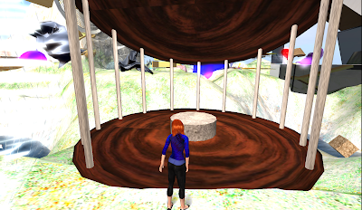
Firstly I started with a circle which i flattened to create the ground floor plan. I decided to go with the circular shape for movement where their would be no awkward corners that would be hard to manoeuvre out of. I decided then to go for a natural walnut wood for a sustainable design with smooth floors.

To allow people to know when they have entered my office space, I then included two scripts; one that shows a welcome message of 'Welcome to the office', which is activated when an avatar comes within 3 metres. The second announces an avatar's arrival by playing a sound. This would be for the benefit of visually impaired or death people.

Next I created a central column made out of concrete for the base of the office, as well as a base for the office desk. this construction would provide stability and strength. to further enhance this I created evenly spaced columns to surround the outside of the circle for added support, as well as a frame for a handrail and roof. To highlight this detail in the construction, I lit the ground floor from below to highlight this feature.


I then established a roof that would add visual interest to the design, highlighting the framing and construction of the office. It was also made out of the same texture for consistency for those who are visually impaired, also for sustainable purposes.


For safety purposes, a handrail was added to surround the circular perimeter, and to also provide a sense of placement. The handrail is intened to visually stand out due to lighting contrast and has been designed at a similar level and same texture as the desk surface. The desk has been placed to surround the inner column for easy accessibility, plus it provides an ample amount of desk space. Originally I thought of making the table top of the desk lay on top of the circular column to provide fruther desk space. However I deemed this unnessacry as people would not be able to reach the centre of the desk anyway, especially people in wheelchairs. For storage I could possibly place something around the outer edges of the office, as I cannot place them under the desk as they would interfere with leg space.

Once I had created an opening in the handrail, so that my office was accessible, I moved on to closing up the exterior face with glass pannels that would allow for light to come into the building as a sustainable approach, as well as create amazing 360degrees views.
At the moment there are gaps between the roofing system and the glass windows for ventalation and to enhance the indoor-outdoor flow, however I may change this for a sealed office but at the moment the open spaces create interesting geometric shapes with the roof.
Inside the office
So there you have it. My first attempt at creating my architectural office space. I intend to develop and change it as new ideas and inspirations come, but this is my first general idea.